I’ve been reading through Kohavi’s et al.’s Trustworthy Online Controlled Experiments, which gives a ton of great advice on how to do A/B testing well. This post is about one nugget regarding the 
(This appears in Chapter 19 of the book, “The A/A Test”. In the book they mention this issue in the context of computing the 
Imagine we are doing a one-sample
set.seed(1)
x <- runif(100, min = 0, max = 1) + 10
x[100] <- 100000
Every single value in x is much higher zero. We have this one huge outlier, but it’s in the “right” direction (i.e. greater than all values in x, much greater than zero). If we run a two-sided
Wrong! Here is the R output:
t.test(x)$p.value
# [1] 0.3147106
The problem is because of that outlier that x has. Sure, it increases the mean of x by a lot, but it also increases the variance a ton! Remember that the
Here’s a sketch of the mathematical argument. Assume the outlier has value 


![\begin{aligned} \text{Variance} &= \mathbb{E}[X^2] - (\mathbb{E}[X])^2, \\ \text{Sample variance} s^2 &\approx \frac{o^2}{n} - \frac{o^2}{n^2} \approx \frac{o^2}{n}. \end{aligned}](https://s0.wp.com/latex.php?latex=%5Cbegin%7Baligned%7D+%5Ctext%7BVariance%7D+%26%3D+%5Cmathbb%7BE%7D%5BX%5E2%5D+-+%28%5Cmathbb%7BE%7D%5BX%5D%29%5E2%2C+%5C%5C++%5Ctext%7BSample+variance%7D+s%5E2+%26%5Capprox+%5Cfrac%7Bo%5E2%7D%7Bn%7D+-+%5Cfrac%7Bo%5E2%7D%7Bn%5E2%7D+%5Capprox+%5Cfrac%7Bo%5E2%7D%7Bn%7D.+%5Cend%7Baligned%7D&bg=ffffff&fg=333333&s=0&c=20201002)
Hence, the

depending on whether 
2 * pnorm(-1)
# [1] 0.3173105
Another way to understand this intuitively is to make a plot of the data. First, let’s plot the data without the outlier:
plot(x[1:99], pch = 16, cex = 0.5, ylim = c(0, max(x[1:99])),
     xlab = "Observation index", ylab = "Value",
     main = "Plot of values without outlier")
abline(h = 0, col = "red", lty = 2)

It’s obvious here that the variation in x pales in comparison to the distance of x from the 

plot(x, pch = 16, cex = 0.5, ylim = c(0, max(x)),
     xlab = "Observation index", ylab = "Value",
     main = "Plot of values with outlier")
abline(h = 0, col = "red", lty = 2)

Not so obvious that the mean of x is different from zero now right?
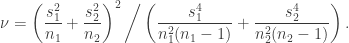
 samples from group 1 and
  samples from group 2. For
  , let
, let  and
and  denote the sample mean and sample variance of group
  respectively. Welch’s t-statistic is defined by
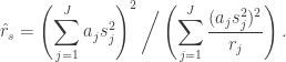
 be
be  independent sample variances each having
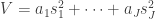
  degrees of freedom. Consider the combined estimate
 are constants. (Back then, this was called a complex estimate of variance.) The exact distribution of
  is too difficult to compute (no simple closed form? I’m not sure), so we approximate it with a
 ![\begin{aligned} r_s = \left( \sum_{j=1}^J a_j \mathbb{E}[s_j^2] \right)^2 \bigg/ \left( \sum_{j=1}^J \dfrac{(a_j \mathbb{E}[s_j^2])^2}{r_j} \right). \end{aligned}](https://s0.wp.com/latex.php?latex=%5Cbegin%7Baligned%7D+r_s+%3D+%5Cleft%28+%5Csum_%7Bj%3D1%7D%5EJ+a_j+%5Cmathbb%7BE%7D%5Bs_j%5E2%5D+%5Cright%29%5E2+%5Cbigg%2F+%5Cleft%28+%5Csum_%7Bj%3D1%7D%5EJ+%5Cdfrac%7B%28a_j+%5Cmathbb%7BE%7D%5Bs_j%5E2%5D%29%5E2%7D%7Br_j%7D+%5Cright%29.+%5Cend%7Baligned%7D&bg=ffffff&fg=333333&s=0&c=20201002)
 ,
,  and
and  .
. and
and  , each with degrees of freedom
  and
and  . Let’s compute the degrees of freedom for the chi-squared distribution that approximates
  .
.![\sigma_j^2 = \mathbb{E}[s_j^2]](https://s0.wp.com/latex.php?latex=%5Csigma_j%5E2+%3D+%5Cmathbb%7BE%7D%5Bs_j%5E2%5D&bg=ffffff&fg=333333&s=0&c=20201002) . From our set-up, we have
. From our set-up, we have  , thus
![\begin{aligned} \text{Var} (s_j^2) &= \left( \frac{\sigma_j^2}{r_j} \right)^2 \mathbb{E} [\chi_{r_j}^2] = \left( \frac{\sigma_j^2}{r_j} \right)^2 \cdot (2 r_j) \\ &= \frac{2\sigma_j^4}{r_j} \quad \text{for } j = 1, 2, \\ \text{Var} (V) &= 2\left( \frac{\sigma_1^4}{r_1} + \frac{\sigma_2^4}{r_2} \right), \end{aligned}](https://s0.wp.com/latex.php?latex=%5Cbegin%7Baligned%7D+%5Ctext%7BVar%7D+%28s_j%5E2%29+%26%3D+%5Cleft%28+%5Cfrac%7B%5Csigma_j%5E2%7D%7Br_j%7D+%5Cright%29%5E2%C2%A0+%5Cmathbb%7BE%7D+%5B%5Cchi_%7Br_j%7D%5E2%5D+%3D+%5Cleft%28+%5Cfrac%7B%5Csigma_j%5E2%7D%7Br_j%7D+%5Cright%29%5E2%C2%A0+%5Ccdot+%282+r_j%29+%5C%5C++%26%3D+%5Cfrac%7B2%5Csigma_j%5E4%7D%7Br_j%7D+%5Cquad+%5Ctext%7Bfor+%7D+j+%3D+1%2C+2%2C+%5C%5C++%5Ctext%7BVar%7D+%28V%29+%26%3D+2%5Cleft%28+%5Cfrac%7B%5Csigma_1%5E4%7D%7Br_1%7D+%2B+%5Cfrac%7B%5Csigma_2%5E4%7D%7Br_2%7D+%5Cright%29%2C+%5Cend%7Baligned%7D&bg=ffffff&fg=333333&s=0&c=20201002)
 be a chi-squared distribution with
  degrees of freedom means that
 ![\dfrac{r V}{\mathbb{E}[V]} \sim \chi_r^2](https://s0.wp.com/latex.php?latex=%5Cdfrac%7Br+V%7D%7B%5Cmathbb%7BE%7D%5BV%5D%7D+%5Csim+%5Cchi_r%5E2&bg=ffffff&fg=333333&s=0&c=20201002) . Under this approximation,
. Under this approximation,![\text{Var}(V) = \left(\dfrac{\mathbb{E}[V]}{r} \right)^2 \cdot (2 r) = \dfrac{2(\sigma_1^2 + \sigma_2^2)^2}{r}.](https://s0.wp.com/latex.php?latex=%5Ctext%7BVar%7D%28V%29+%3D+%5Cleft%28%5Cdfrac%7B%5Cmathbb%7BE%7D%5BV%5D%7D%7Br%7D+%5Cright%29%5E2+%5Ccdot+%282+r%29+%3D+%5Cdfrac%7B2%28%5Csigma_1%5E2+%2B+%5Csigma_2%5E2%29%5E2%7D%7Br%7D.&bg=ffffff&fg=333333&s=0&c=20201002)

 .
.